Are you a designer looking to create exceptional user interfaces that captivate and impress? Like a good book, a well-designed UI should hook users from the beginning, guiding them effortlessly through every interaction. Following some basic UI design principles can easily make your design standout in the crowd.
But where do you start? Don’t worry, we’ve got you covered. In this blog, we’ll explore key UI design principles that every designer should know. Whether you’re a seasoned pro or just starting your design journey, these principles will help you create user-friendly interfaces that leave a lasting impact.
Understanding UI Design Principles
User Interface (UI) design plays a vital role in creating user-friendly and visually appealing digital products. It focuses on the visual elements and interactions that users encounter when using a website, application, or other digital interfaces. To effectively design UI, there are key UI design principles that every designer should be familiar with. Let’s dive into these UI design principles and understand their importance in creating exceptional UI designs.
1. Clarity
Clarity is a fundamental of UI design principles that focuses on creating interfaces that are clear and easily understandable to users. When it comes to designing a user-friendly interface, clarity is key in ensuring that users can quickly and intuitively navigate through the design without any confusion or frustration.
Using simple and concise language in your interface design helps users easily understand the purpose and functionality of different elements. Avoid using complex terms that might be unfamiliar to your target audience. Keep your messaging and instructions straightforward, ensuring clarity in all aspects of your design.
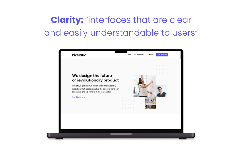
Establishing a clear visual hierarchy is crucial for a well-designed interface. By organizing elements based on their importance and creating a clear flow, users can understand the relationship between different components. Utilize visual cues such as size, color, and placement to guide users’ attention to the most important elements first.
When designing your interface, consider the language and terminology that your target users are familiar with. Using their language and terminology can significantly improve clarity and make the interface more relatable and user-friendly.
2. Consistency
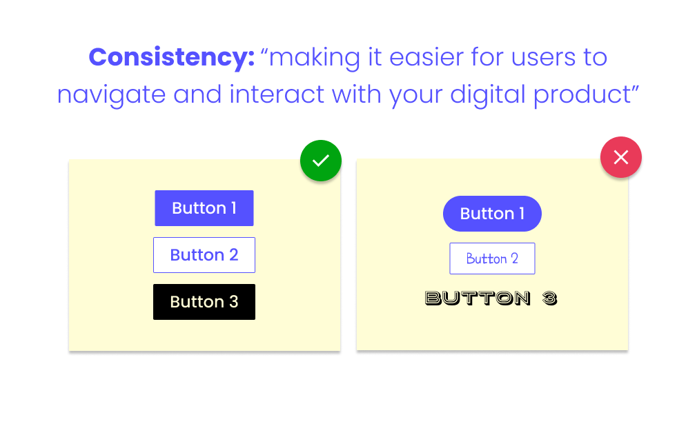
Consistency is another essential one of the UI design principles that plays a crucial role in creating a cohesive and user-friendly interface. By maintaining consistency throughout your design, you provide users with predictability and familiarity, making it easier for them to navigate and interact with your digital product.
Visual Consistency:
To achieve visual consistency, you should ensure that all elements in your interface follow the same design language, including colors, typography, icons, and layout. This establishes a sense of harmony and makes the interface visually appealing.
(List) Tips for achieving visual consistency:
- Use a consistent color scheme throughout the interface, employing a predefined palette to maintain visual coherence.
- Follow a clear typographic hierarchy to guide users and enhance readability.
- Implement consistent iconography that adheres to recognized design conventions, aiding users in understanding their meaning.
- Maintain a consistent layout by using grids and alignment, helping users navigate the interface effortlessly.
Functional Consistency:
Functional consistency refers to how different components and interactions behave consistently across the interface. Users expect the same actions to produce the same results, regardless of the context.
(List) Tips for achieving functional consistency:
- Ensure that interactive elements, such as buttons and links, behave consistently. For instance, use a standard color, size, and placement for buttons throughout the interface.
- Maintain consistent interaction patterns, such as swipe gestures or dropdown menus, across different screens to prevent confusion.
- Align navigation patterns, such as the placement of the menu or search bar, across the entire interface, so users can easily find and use them.

3. Simplicity
When it comes to UI design, simplicity is one of the most important UI design principles to keep in mind. By embracing simplicity, designers can create user interfaces that are intuitive, easy to navigate, and visually appealing. Here are some key considerations:
Remove any unnecessary elements or features that can overwhelm or confuse users. Keep the design clean and focused on the core functionalities of the interface. You must establish a clear visual hierarchy by using appropriate font sizes, colors, and visual elements. This helps guide users’ attention and understanding of the interface’s structure.
Embrace a minimalistic design approach by using ample white space, simple shapes, and clean lines. This not only adds elegance to the interface but also reduces cognitive load for users. Incorporate visual elements such as icons, illustrations, and images strategically to enhance user understanding and engagement. Avoid using visuals solely for decorative purposes.

4. Familiarity
Incorporating commonly recognized symbols and icons can enhance familiarity. For example, using a magnifying glass icon for search or a hamburger menu icon for navigation can instantly convey their respective functionalities without requiring additional explanation.
Design the UI in a way that aligns with users’ mental models or expectations. Consider the conventions and patterns that users are already familiar with in the real world or from other digital experiences. This alignment increases the ease of use and minimizes the learning curve for new users.
5. Responsiveness
Design your user interface using fluid grids and flexible elements that can automatically adjust their size and position based on the available screen real estate. This allows your UI to scale smoothly across different devices, from desktops to smartphones which is another UI design principles.
You need to define breakpoints in your design to indicate when the layout should adapt to a different screen size. Consider the most common device resolutions and adjust your design accordingly. Implementing breakpoints helps optimize the user experience and visual hierarchy for different devices.
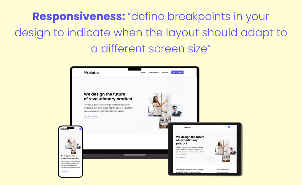
Start your design process by focusing on the smallest screen size first, such as mobile devices. This ensures that the most critical elements and content are prioritized and effectively displayed on smaller screens. As you scale up to larger screens, you can progressively enhance the UI by adding more features and utilizing the available space.
Use responsive image and media techniques to ensure that visual assets adapt to different screen sizes without losing their quality or appearing distorted. Consider using responsive images, CSS media queries, and adaptive playback techniques for videos. Optimize your UI for touch-based interactions on mobile devices. Use appropriate button sizes, spacing, and interactive elements to accommodate finger-tap navigation. Avoid placing interactive elements too close together to prevent accidental taps.
6. Accessibility
Avoid complex jargon and technical terms. Use simple and easy-to-understand language that can be easily comprehended by a wide range of users. Provide alternative text for images so that users with visual impairments rely on screen readers to navigate web pages. Including alt text for images allows screen readers to describe the visual content accurately.
The Web Content Accessibility Guidelines (WCAG) provide a comprehensive set of guidelines to ensure accessibility. Follow these guidelines to make your interface accessible to users with disabilities. Ensure sufficient contrast between text and background colors to accommodate users with visual impairments and color blindness. Use tools like WCAG color contrast checkers to ensure compliance. Make sure your interface can be easily navigated using keyboard controls alone. This is especially important for users with motor disabilities who may not be able to use a mouse.
Include captions or transcripts for videos and audio content to cater to users with hearing impairments. This allows them to access the information presented in these formats. Use fonts that are legible and provide options to adjust the font size for users who may have visual impairments or prefer larger text.
7. Visual Hierarchy
Visual Hierarchy is different among all the UI design principles that determine the order of importance and attention given to different elements on a screen. By effectively utilizing visual hierarchy, designers can guide users’ focus and create a seamless user experience. Visual hierarchy helps users navigate through the interface effortlessly by presenting information in a prioritized manner. It ensures that users can quickly identify the most important elements on a page, leading to better comprehension and interaction.
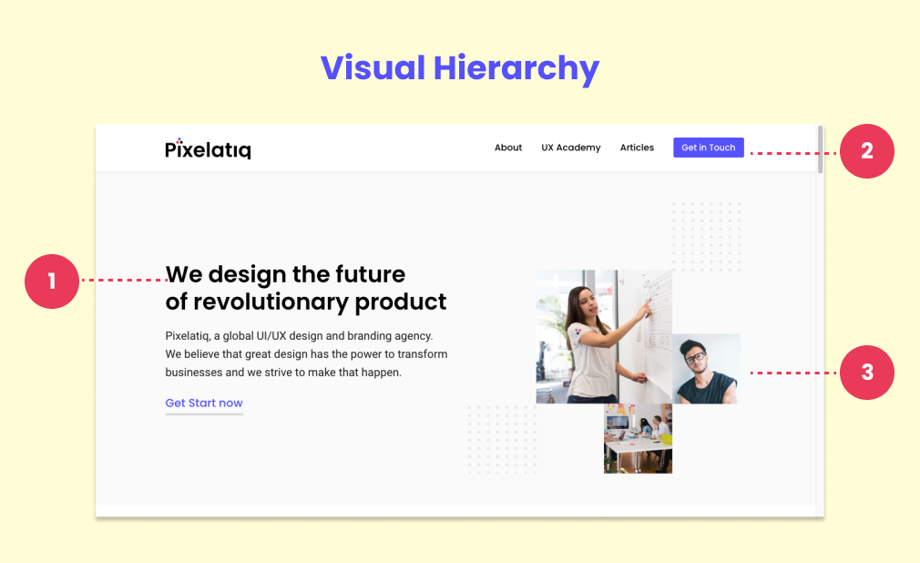
The key to creating an effective visual hierarchy is to organize the content based on its level of importance. This can be achieved using size, color, contrast, and alignment. Larger and bolder elements tend to grab attention first, while elements with lighter colors or lower contrast are perceived as less significant. The most important information or actions should be prominently displayed, while less important elements should be visually downplayed. The goal is to guide users intuitively from one element to another, allowing them to follow the flow of information effortlessly. Font size, weight, and style play important roles in establishing hierarchy.
Headings and subheadings should have larger font sizes and more prominent styles than body text. Consistency in typography across the interface helps users understand the relationship between different elements. To direct users’ attention, it’s essential to emphasize the primary call-to-action buttons or links. This can be achieved by utilizing contrasting colors, and larger sizes, or placing them strategically within the visual hierarchy.
8. Implementing Strong Navigation and Structure in UI Design
When it comes to creating a user-friendly interface, the navigation and structure of your UI design play a crucial role in ensuring a smooth and intuitive user experience. By implementing strong navigation and structure, you can guide your users effortlessly through your digital product and help them find the information they need quickly and easily.
One of the fundamental UI Design principles of effective user interface design is to have clear and consistent menus. Ensure that your menus are easily identifiable and placed in a prominent location. Use clear and concise labels that accurately represent the content or functionality behind each menu item. Consistent menu placement throughout your interface will help users familiarize themselves with the navigation system.
A well-defined hierarchical structure allows users to understand the relationships between different sections and elements within your interface. Logically organize your content, with primary categories at the top and subcategories underneath. This helps users navigate through your interface with ease and find relevant information without unnecessary clicks.
Conclusion
Mastering the UI design principles is essential for every designer looking to create user-friendly interfaces that captivate and engage users. By implementing these principles, you can enhance the overall user experience and ensure your designs are intuitive, visually pleasing, and functional. The first principle to remember is simplicity. Keep your designs clean and uncluttered, focusing on the essential elements that guide users seamlessly through your interface. Secondly, prioritize consistency across your design elements, such as typography, color scheme, and button styles, to create a cohesive and intuitive experience. Another important principle is visual hierarchy. By using size, color, and placement strategically, you can draw attention to the most important elements and guide users toward desired actions. Remember to prioritize accessibility.
Recommended Reading for UX designers, Founders, and Product Owners
- Designing for the Digital Age: How to Create Human-Centered Products and Services
- The Design Of Everyday Things
- Hooked: How to Build Habit-Forming Products
- Don’t Make Me Think
- Laws of UX: Using Psychology to Design Better Products & Services
- Seductive Interaction Design: Creating Playful, Fun, and Effective User Experiences
- Lean UX: Designing Great Products with Agile Teams
- 100 Things Every Designer Needs to Know About People
- The Elements of User Experience
- Designing Interfaces: Patterns for Effective Interaction Design
FAQ
How can I stay updated on UI design principles, trends, and best practices?
One way to stay updated on UI design trends and best practices is to follow industry leaders and influencers on social media platforms like Twitter and LinkedIn. You can also attend conferences and workshops, read design blogs and books, and participate in online communities and forums to learn from other designers. Additionally, regularly testing and seeking feedback on your designs can help you stay current and improve your skills.
How does UI design differ from UX design?
While both UI (User Interface) and UX (User Experience) design focus on creating a positive user experience, they have distinct roles. UI design focuses on the visual and interactive elements of a product, while UX design takes a more holistic approach, considering the overall user journey and how to make it as smooth and seamless as possible. UI designers work on creating the look and feel of a product, while UX designers focus on how the user interacts with it.
How can I improve my UI design skills?
Here are some tips for improving your UI design skills: Stay updated on design trends and best practices. Practice designing on different platforms and devices. Get feedback from other designers and users. Keep the user in mind and prioritize usability. Use consistent visual elements and branding. Use white space effectively. Pay attention to details and make sure everything is aligned. Test your designs and make adjustments based on user feedback. Continuously learn and improve your skills. Stay organized and use design tools to streamline your process.
