Are you tired of having a website that underperforms, fails to ensure user engagement, or doesn’t drive the results you desire? Creating a website that can ensure maximum user engagement and maximize your online presence is not an elusive dream. You will get to know about three easy ways that will transform your website into a powerful tool for your business or personal brand.
You will learn about those ways and how to implement them effectively in this article. We understand the frustrations and challenges that come with website development, which is why we are here to simplify the process and empower you to achieve your goals.
- 1. Optimize Small Picture for Big Screen
- 2. Make Your Interface Design Responsive to Ensure User Engagement
- 3. Use Left-Sided Vertical Navigation to Increase User Engagement
- The Bottom Line
- FAQ
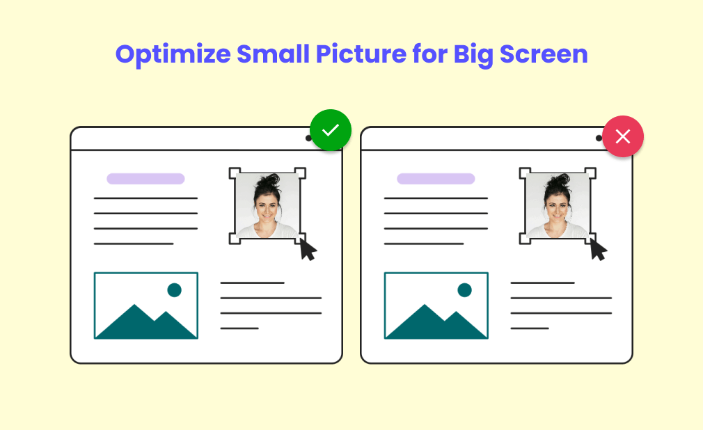
1. Optimize Small Picture for Big Screen

When you browse randomly what attracts you most between visuals and writings? It must be the visuals! Visuals are 10 times more persuasive compared to writing. By ensuring that your pictures are optimized for different screen sizes, you can enhance the user experience and assure greater user engagement.
The Importance of Image Optimization
When it comes to website performance, image optimization is key. Large images can significantly slow down your website’s loading speed, resulting in a negative user experience and less user engagement. By optimizing images, you can reduce their file size without compromising on visual quality, allowing your website to load faster and provide a smooth browsing experience for your visitors which can drive greater user engagement.

Compressing Images for Efficiency
One of the most effective ways to optimize images is by compressing them. This process reduces the file size of an image, making it easier to load without sacrificing image quality. There are several tools available that can help you compress images without losing significant visual details. By compressing your images, you can strike the perfect balance between image quality and website performance.
Best Tools for Image Compression
- TinyPNG
- JPEGmini
- Optimizilla
Using Responsive Images to Increase User Engagement
With the increasing use of various devices with different screen sizes, it’s essential to ensure that your website images are responsive. Responsive images adapt to different screen sizes, automatically adjusting their dimensions to fit the device used. By using responsive images, you can optimize the visual experience for each user, regardless of whether they are using a desktop, tablet, or smartphone, and expect greater user engagement.
Steps for implementing responsive images
- Use the HTML “img” tag with the “srcset” attribute.
- Provide multiple image options with different sizes or resolutions.
- Use CSS media queries to specify different images for different screen sizes.
2. Make Your Interface Design Responsive to Ensure User Engagement
Having a responsive interface design is crucial to ensure user engagement. With the increasing number of users accessing websites through various devices, it is essential to ensure that your website provides a smooth experience across all platforms. Whether it’s a desktop, smartphone, or tablet, your audience should be able to navigate through your website with ease. Here are some game-changing rules to make a responsive interface design:
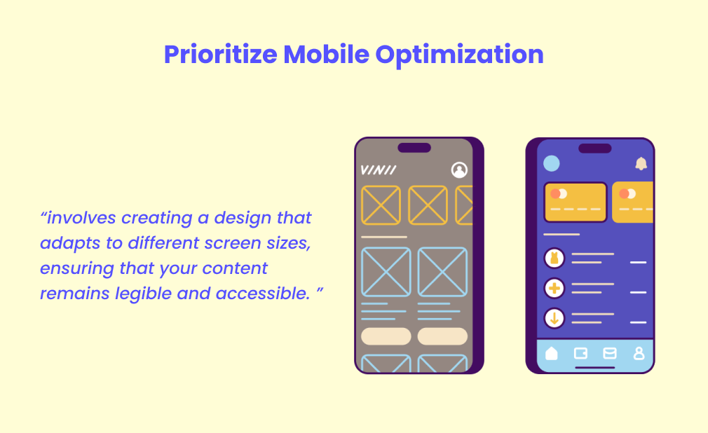
Prioritize Mobile Optimization
With most internet users browsing websites on their smartphones, optimizing your website for mobile devices is a must. Mobile optimization involves creating a design that adapts to different screen sizes, ensuring that your content remains legible and accessible. Consider using responsive frameworks or mobile-friendly themes to make the process easier. This will not only enhance user engagement but also improve your website’s search engine rankings.

To ensure your website is responsive, it’s essential to adopt a mobile-first approach. Instead of designing for desktop first and then adapting for mobile, start by creating a streamlined version optimized for mobile devices. This approach forces you to prioritize essential elements and focus on delivering a smooth browsing experience. Once the mobile version is perfected, you can then enhance the design for larger screens.
Key steps in a mobile-first approach
- Identify the most important content and features for mobile users.
- Streamline navigation for seamless mobile browsing.
- Optimize images and media for faster loading on mobile devices.
- Test your design across various devices and screen sizes.
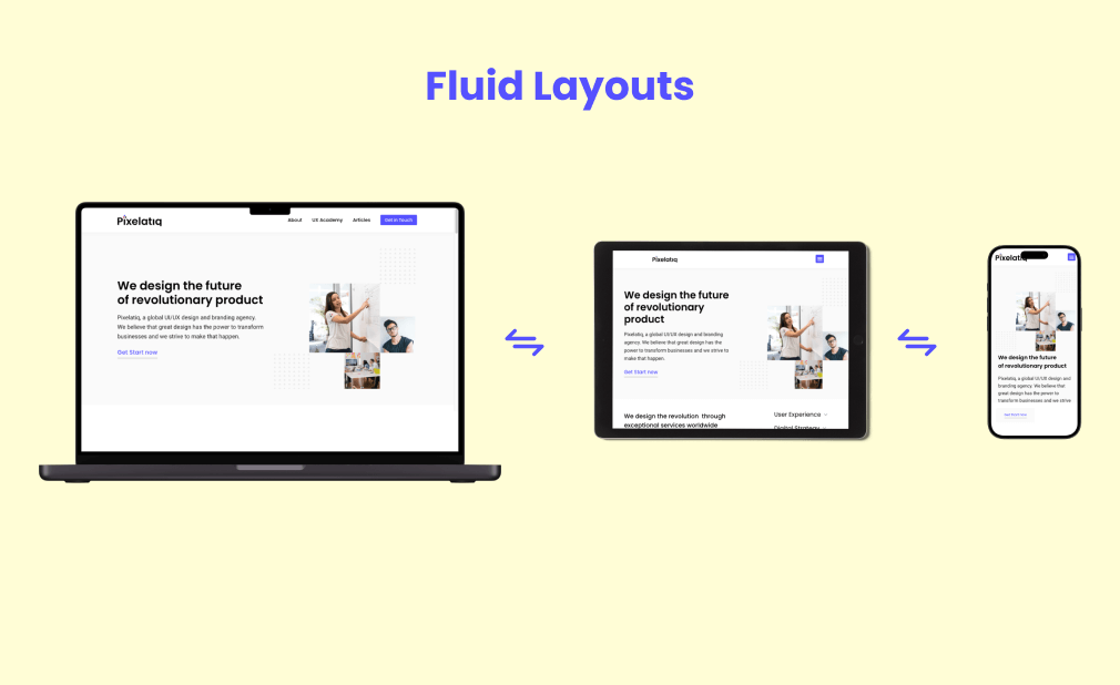
Fluid Layouts

To create a responsive design, implementing fluid layouts is vital. Unlike fixed layouts, fluid layouts are flexible and adjust to fit different screen resolutions. This means that your website’s content will automatically resize according to the device being used. By using relative sizing units like percentages instead of fixed pixels, your website design will adapt to fill the available space, delivering a consistent and visually appealing experience.
Key advantages of fluid layouts include
- Consistent user experience across devices.
- Improved accessibility for visually impaired users.
- Higher chances of engaging and retaining visitors.
3. Use Left-Sided Vertical Navigation to Increase User Engagement
Left-sided vertical navigation is a game-changer when it comes to making a smart and user-friendly website. By strategically placing your navigation menu on the left side of your website, you can enhance the user experience and increase user engagement. Here are three key reasons why incorporating left-sided vertical navigation is a must for your website:
Enhanced User Navigation and Increase User Engagement
With left-sided vertical navigation, users can easily access different sections and pages of your website without any confusion. The vertical layout allows for a clear and organized menu structure, making it easier for visitors to navigate through your site and find the information they’re looking for. This intuitive design improves the overall user experience and keeps visitors engaged, reducing bounce rates and increasing conversion rates.
Consistent Visibility for User Engagement
Placing your navigation on the left side of the website ensures that it remains visible and accessible at all times. Unlike top or horizontal navigation menus that may get scrolled out of view, left-sided vertical navigation stays in sight as users scroll down the page. This consistent visibility enables users to quickly move between different sections, enhancing the overall usability of your website.
Efficient Use of Screen Space
Left-sided vertical navigation optimizes the use of screen space, particularly on large monitors or wide screens. By utilizing the vertical layout, you can take advantage of the extra screen real estate and comprehensively display your menu items. This allows for longer navigation menus or submenus without cluttering the website or compromising the visual appeal.
In addition, the vertical orientation also works well with responsive design, ensuring that your website remains accessible and user-friendly on various devices, including smartphones and tablets.
To effectively implement left-sided vertical navigation, consider using clear icons or labels for each menu item, providing descriptive submenus when needed, and ensuring that the menu is always visible even when the user scrolls down the page.
The Bottom Line
Making a website that contains great user engagement requires many considerations. Optimizing images, ensuring responsiveness, and embracing left-sided vertical navigation are the three easiest ways to enhance the user experience and keep the users long time on the website.
These rules are essential for increasing user engagement and driving desired results for your business. One crucial aspect of a smart website is image optimization. Compressing and correctly sizing images can significantly improve site loading speed and overall performance.
This not only enhances user experience but also contributes to better search engine rankings. Another important rule is ensuring responsiveness across different devices. With the rise of mobile usage, your website must adapt seamlessly to various screen sizes. By providing a consistent and user-friendly experience, you enhance customer satisfaction and increase the likelihood of conversions.
FAQ
What makes a website “smart”?
A smart website has been deliberately designed and optimized to provide a seamless and user-friendly experience. This includes optimizing images to improve loading speed, ensuring responsiveness across different devices, and utilizing left-sided vertical navigation for easy navigation. These elements work together to create a website that is intuitive, efficient, and engaging for users.
What is responsive design?
Responsive design is a design approach that ensures a website’s layout and content adapt to different screen sizes, resolutions, and devices. This allows for an optimal viewing and interaction experience for users, regardless of the device they are using to access the website. This is achieved through the use of flexible grids, images, and CSS media queries.
Why is left-sided vertical navigation beneficial for a website?
Left-sided vertical navigation can greatly improve the user experience on a website. This type of navigation allows for easier scanning and browsing, as users are accustomed to reading from left to right. It also frees up horizontal space for important content and can make the website feel more organized and visually appealing. Additionally, it can be easier for users to access the navigation menu with their thumb on mobile devices, making the website more mobile-friendly.

2 thoughts on “3 Easy Ways to Increase Your User Engagement”
Pingback: UI UX Design to Make Your Product Design Great
Pingback: AI for UX Design to Make Your Productivity High - Pixelatiq