Do you want your meticulously designed screens to look completely different on various devices? Do you find ensuring a consistent user experience across different platforms challenging? If so, you’re not alone. Screen design plays a crucial role in shaping user perceptions and satisfaction.
In this blog, we’ll dive into 10 tips to help you create designs that deliver a seamless user experience, no matter the device. From responsive layouts to intuitive navigation, we’ll explore practical strategies and techniques that will empower you to design screens that captivate and engage users. Whether you’re a seasoned designer or just starting, these tips will elevate your skills and help you achieve coherence across multiple devices.
- 1. Prioritize Responsive Design
- 2. Optimize for Touchscreens
- 3. Keep Navigation Intuitive
- 4. Ensure Readability in Screen Design
- 5. Maintain Consistent Branding
- 6. Minimize Load Times
- 7. Test Across Devices
- 8. Accessibility Considerations for Screen Design
- 9. Embrace Scalability
- 10. Gather User Feedback for Screen Design
- The Bottom Line
- FAQ
1. Prioritize Responsive Design
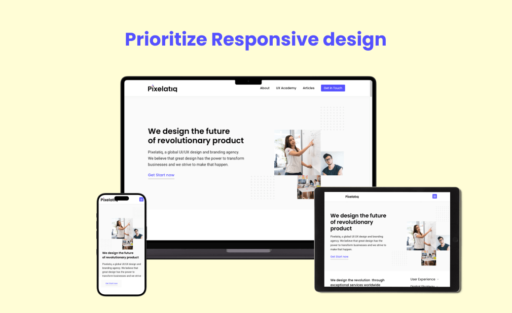
When prioritizing responsive screen design, begin with a mobile-first approach, acknowledging the prevalence of mobile users. Utilize UI frameworks like Bootstrap for efficient adaptation to various screens. Design with touch interaction in mind, ensuring elements are user-friendly on mobile devices.

Maintain visual consistency across devices to strengthen brand identity and trust. Optimize font size and line length for readability on different screens. Embrace white space for improved aesthetics and legibility. Establish a clear visual hierarchy to guide users seamlessly through your screen design. These practices collectively enhance the overall user experience across diverse devices and ensure responsive design.
2. Optimize for Touchscreens
In the era of mobile dominance, optimizing screen design for touch interaction is vital. Ensure user-friendly touch targets, adhering to a minimum size of 48 pixels. Embrace intuitive gestures like swiping and pinching to enhance user experience. Consider thumb reach for one-handed usability and position key elements accordingly.
Optimize font size for readability without straining users’ eyes. Provide engaging visual feedback through color changes and animations for a satisfying interaction. Mindful use of white space prevents accidental taps and improves overall usability. Lastly, adopt adaptive design principles to seamlessly accommodate diverse devices and screen orientations in your screen design.
3. Keep Navigation Intuitive
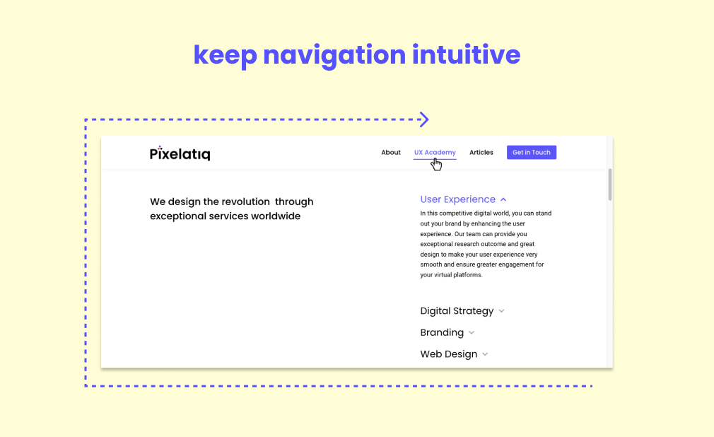
Navigation is pivotal for a seamless user experience in screen design across devices. Employ clear labels, maintaining consistency, and logical grouping in menus. Utilize hierarchical structures for large content. Ensure visibility and accessibility through responsive design. Keep navigation minimal to avoid overwhelming users.

Provide feedback cues like highlighting active pages and breadcrumbs. Integrate a search bar for quick content access. Regularly test and iterate for ongoing improvements, creating an intuitive and user-friendly navigation system in your screen design that facilitates a consistent user experience.
4. Ensure Readability in Screen Design
In screen design, prioritizing readability is paramount for a positive user experience. Choose legible font sizes suitable for all devices and experiment with the right balance. Effective use of white space enhances visual clarity, allowing users to focus on essential content. Establish a visual hierarchy through size, color, and placement, emphasizing key elements.
Opt for clear and legible typography, avoiding complex fonts for optimal readability. Incorporate visual cues like icons to guide users seamlessly. Test across various devices to ensure readability and functionality in your screen design, maintaining a visually appealing and user-friendly interface.
5. Maintain Consistent Branding
Consistent branding is a critical but often overlooked aspect of screen design, crucial for creating a memorable user experience and building trust. To achieve this, integrate brand colors, typography, and logos consistently across all devices. Adopt a unified visual style, incorporating a design system for coherence. Maintain consistency in layout, spacing, and visual feedback, ensuring a harmonious and user-friendly interface.
By prioritizing consistent branding in screen design, you establish credibility, enhance recognition, and provide users with a seamless experience across various devices.
6. Minimize Load Times
In the realm of screen design, optimizing load times is imperative for a seamless user experience across devices. Start by compressing and resizing images to enhance webpage speed. Enable browser caching for stored elements, reducing subsequent load times. Minify CSS and JavaScript files by removing unnecessary characters. Efficiently load CSS, employing critical path rendering for visual optimization.
Harness Content Delivery Networks (CDNs) to minimize latency by distributing static files. Prioritize above-the-fold content to engage users swiftly while background elements load. Lastly, reduce HTTP requests by consolidating files and utilizing CSS sprites, ensuring a faster and more responsive screen design experience.
7. Test Across Devices
Ensuring a seamless user experience in screen design across diverse platforms involves strategic testing and considerations. Embrace responsive design, adapting layouts dynamically for various screen sizes. Prioritize essential content and establish a strong visual hierarchy, especially on limited mobile screen real estate. Optimize font sizes for readability across different devices, avoiding strain on users’ eyes.
Test touch interactions to ensure responsiveness on mobile devices. Maintain consistency in UI elements, including color schemes and visual styles, for a cohesive experience in your screen design across multiple platforms.
8. Accessibility Considerations for Screen Design
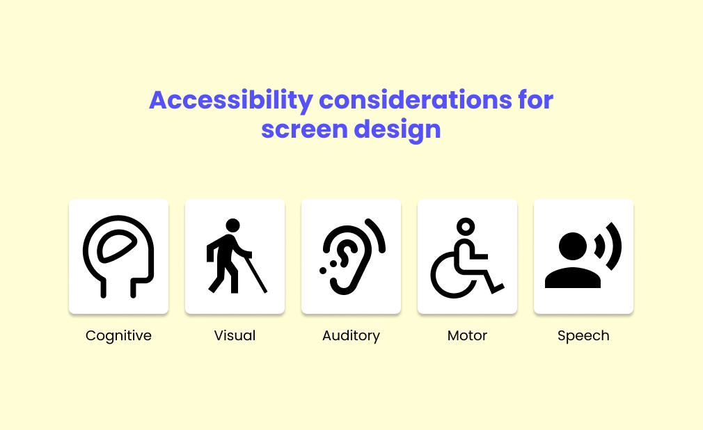
Inclusive screen design is paramount for a positive user experience, catering to users of all abilities. Prioritize color contrast for readability, aiming for a ratio of at least 4.5:1. Ensure images include descriptive alt text for users with visual impairments.

Optimize keyboard navigation for those relying solely on it and use semantic HTML for better screen reader compatibility. Consider font size and legibility, especially on smaller screens, and design for touch interaction on mobile devices. Provide clear visual feedback for user actions and regularly test with assistive technologies to identify and address potential accessibility barriers in your screen design.
9. Embrace Scalability
In screen design, prioritizing scalability is essential for a consistent user experience across diverse devices. Implement responsive design to seamlessly adapt interfaces to different screen sizes. Prioritize vital information for smaller screens, utilizing a mobile-first approach. Optimize font sizes for readability, particularly on smaller screens, and incorporate ample white space for visual balance.
Establish a clear visual hierarchy with contrasting elements. Maintain consistency in UI elements across devices for seamless navigation. Pay attention to touch interactions, ensuring appropriately sized targets for mobile devices. Choosing a versatile UI framework like Bootstrap or Foundation can further enhance scalability in your screen design, providing responsive components and maintaining consistency.
10. Gather User Feedback for Screen Design
In screen design, ensuring a consistent user experience across devices is achievable through proactive user feedback. Conduct surveys and questionnaires to gather insights, focusing on user challenges and preferences. Run usability tests with representative users to observe interactions and address issues. Utilize heatmaps for visualizing user engagement patterns and optimize information placement.
Analyze user behavior metrics from analytics tools to identify areas for improvement. Form testing groups or engage beta testers for diverse perspectives on your screen design. Monitor social media for user discussions and promptly address raised concerns. Encourage direct feedback through in-app or website forms to refine your design decisions for an enhanced overall user experience.
The Bottom Line
In wrapping up our journey through the intricate world of screen design, let’s take a moment to empower you, our savvy readers. Picture yourself as the maestro orchestrating a symphony of visual delight and seamless interactions across diverse devices. With responsive design as your magic wand, conjure interfaces that dance effortlessly on the stage of smartphones, tablets, and desktops.
Forge a visual hierarchy that guides users like a trusted compass, utilizing white space as the breathing room that elevates your design from good to captivating. Let your font sizes sing legibility tunes, especially for our mobile maestros, and ensure your interactive elements are the virtuosos of touch-friendly brilliance. Paint your screen canvas with a color scheme that resonates with brand harmonies, inviting users into a world of visual ecstasy. Keep the UI consistent, a reliable companion guiding users through the digital labyrinth. Shower them with visual feedback, the secret sauce that transforms interactions into a delightful dance.
As you delve into UX design principles, remember you’re not just designing screens; you’re crafting experiences. Conduct research, gather feedback, and let your designs evolve, like a masterpiece constantly refined by the artist’s hand.
FAQ
What is screen design?
Screen design is the process of creating visual layouts for digital screens, such as computer monitors, smartphones, and tablets. This includes designing the interface, placement of elements, and overall aesthetic to provide an optimal user experience. It involves a combination of graphic design, user experience (UX) design, and user interface (UI) design principles to create a cohesive and functional screen layout.
What is responsive design and why is it important?
Responsive design is a design approach that allows a website or application to adapt and respond to different screen sizes and devices. It is important because it ensures that the user experience remains consistent and user-friendly, regardless of the device being used. This leads to increased usability, satisfaction, and overall success of the design.
What does scalability mean in terms of screen design?
Scalability in screen design refers to the ability of a design to adapt and function well on different devices and screen sizes without losing its visual appeal and usability. It involves creating a flexible and responsive design that can adjust to various screen resolutions and orientations. This ensures that the user experience remains consistent and enjoyable, regardless of the device being used.
